7. Tutorial to simulate data using WGANs#
Take into account the next notes if you run the code on Google colab.
Note 1: If you care about speed, make sure your colab runtime uses a GPU. Do this by selecting ‘Runtime’ -> ‘Change Runtime Type’ -> ‘Hardware Accelerator’ -> ‘GPU’ (the runtime will restart and you’ll have to re-run this section).
We install the wgan package.
!pip3 install git+https://github.com/gsbDBI/ds-wgan
Collecting git+https://github.com/gsbDBI/ds-wgan
Running command git clone -q https://github.com/gsbDBI/ds-wgan 'C:\Users\User\AppData\Local\Temp\pip-req-build-54nuky7r'
  Cloning https://github.com/gsbDBI/ds-wgan to c:\users\user\appdata\local\temp\pip-req-build-54nuky7r
  Resolved https://github.com/gsbDBI/ds-wgan to commit a65686832ea5bba27f1c6175c252769dc00b2cc3
Requirement already satisfied: numpy in c:\users\user\anaconda3\lib\site-packages (from wgan==0.2) (1.21.5)
Requirement already satisfied: torch>=1.1.0 in c:\users\user\anaconda3\lib\site-packages (from wgan==0.2) (1.12.0)
Requirement already satisfied: pandas in c:\users\user\anaconda3\lib\site-packages (from wgan==0.2) (1.4.2)
Requirement already satisfied: matplotlib in c:\users\user\anaconda3\lib\site-packages (from wgan==0.2) (3.5.1)
Requirement already satisfied: typing-extensions in c:\users\user\anaconda3\lib\site-packages (from torch>=1.1.0->wgan==0.2) (4.1.1)
Requirement already satisfied: python-dateutil>=2.7 in c:\users\user\appdata\roaming\python\python39\site-packages (from matplotlib->wgan==0.2) (2.8.2)
Requirement already satisfied: kiwisolver>=1.0.1 in c:\users\user\anaconda3\lib\site-packages (from matplotlib->wgan==0.2) (1.3.2)
Requirement already satisfied: fonttools>=4.22.0 in c:\users\user\anaconda3\lib\site-packages (from matplotlib->wgan==0.2) (4.25.0)
Requirement already satisfied: cycler>=0.10 in c:\users\user\anaconda3\lib\site-packages (from matplotlib->wgan==0.2) (0.11.0)
Requirement already satisfied: packaging>=20.0 in c:\users\user\anaconda3\lib\site-packages (from matplotlib->wgan==0.2) (21.3)
Requirement already satisfied: pillow>=6.2.0 in c:\users\user\anaconda3\lib\site-packages (from matplotlib->wgan==0.2) (9.0.1)
Requirement already satisfied: pyparsing>=2.2.1 in c:\users\user\anaconda3\lib\site-packages (from matplotlib->wgan==0.2) (3.0.4)
Requirement already satisfied: six>=1.5 in c:\users\user\appdata\roaming\python\python39\site-packages (from python-dateutil>=2.7->matplotlib->wgan==0.2) (1.16.0)
Requirement already satisfied: pytz>=2020.1 in c:\users\user\anaconda3\lib\site-packages (from pandas->wgan==0.2) (2021.3)
We want to simulate a rdata so we neeed pyreadr library.
7.1. Simulating Data#
The workflow for every single distribution you want to fit:
Load and prepare the data
Initialize a
wgan.DataWrapperobject, which takes care of handling the dataInitialize
wgan.Specificationsobject given theDataWrapper, which summarizes hyperparameters, etc.Initialize
wgan.Generator&wgan.Criticgiven theSpecificationsPreprocess the data with the
DataWrapperobjectTrain the
Generator&Criticviawgan.trainReplace columns in df with simulated data from
GeneratorusingDataWrapper.apply_generatorIf you’re interested in them, add the
Criticoutputs to the original and/or the generated df viaDataWrapper.apply_criticExplore the data via
compare_dfs& save the new data.
Since we’re fitting two distributions (Y on X and w, as well as X on w), we’ll have to do all these steps twice. To keep the code concise, we will put the two versions of every obejct type into one list respectively. Watch out so you don’t get confused by that!
7.1.1. Steps 0-3#
First load a data file from our project repo
import pandas as pd
import wgan
import matplotlib.pyplot as plt
import io
import requests
import numpy as np

## loading the data
df = pd.read_csv("https://docs.google.com/uc?id=1kSxrVci_EUcSr_Lg1JKk1l7Xd5I9zfRC&export=download")
df.shape
(28653, 9)
The data we are trying to replicate here is the one we used in Chapter 3.
After loading in our data as df, we will build from it second dataframe called df_balanced, by sampling treated and controls with similar probability from df. We will train our WGAN on df_balanced, which makes sure the quality of the generated outcomes is similar for both treatment groups.
We will need to differentiate categorical from continous variable so we need to identify which variables are continous and categorical.
# We observe the minimum and maximum age from the age variable of the data set to create continuous upper and lower bounds.
print("Minimum and maximum age")
print(np.min(df.age))
print(np.max(df.age))
# We also check the maximun years of education to create continuous upper and lower bounds.
print("Maximum number of years of education")
print(np.max(df.educ))
Minimum and maximum age
18
89
Maximum number of years of education
20
df_balanced = df.sample(len(df), weights=(1-df.w.mean())*df.w+df.w.mean()*(1-df.w), replace=True) # balanced df for training

#We does not simulate X variable because it is a kind of id

# X | tg        This X here represents the set of covariates
continuous_vars_0 = ["age", "educ"]
continuous_lower_bounds_0 = {"age":18, "educ":0}
continuous_upper_bounds_0 = {"age":89, "educ":20}
categorical_vars_0 = ["marital","sex", "polviews", "income"]
context_vars_0 = ["w"]

# Y | X, tg
continuous_vars_1 = []
continuous_lower_bounds_1 = {}
continuous_upper_bounds_1 = {}
categorical_vars_1 = ["y"]
context_vars_1 = ["w","age", "income", "educ", "marital","sex", "polviews"]

# Initialize objects
data_wrappers = [wgan.DataWrapper(df_balanced, continuous_vars_0, categorical_vars_0,
                                  context_vars_0, continuous_lower_bounds_0, continuous_upper_bounds_0),
                 wgan.DataWrapper(df_balanced, continuous_vars_1, categorical_vars_1,
                                  context_vars_1, continuous_lower_bounds_1, continuous_upper_bounds_1)]
specs = [wgan.Specifications(dw, batch_size=6000, max_epochs=1000, critic_lr=1e-3, generator_lr=1e-3,
                             print_every=100, device = "cpu") for dw in data_wrappers] #use "cuda" on device option if you have GPU (faster) and "cpu" if you don't  have
generators = [wgan.Generator(spec) for spec in specs]
critics = [wgan.Critic(spec) for spec in specs]
settings: {'optimizer': <class 'torch.optim.adam.Adam'>, 'critic_d_hidden': [128, 128, 128], 'critic_dropout': 0, 'critic_steps': 15, 'critic_lr': 0.001, 'critic_gp_factor': 5, 'generator_d_hidden': [128, 128, 128], 'generator_dropout': 0.1, 'generator_lr': 0.001, 'generator_d_noise': 28, 'generator_optimizer': 'optimizer', 'max_epochs': 1000, 'batch_size': 6000, 'test_set_size': 16, 'load_checkpoint': None, 'save_checkpoint': None, 'save_every': 100, 'print_every': 100, 'device': 'cuda'}
settings: {'optimizer': <class 'torch.optim.adam.Adam'>, 'critic_d_hidden': [128, 128, 128], 'critic_dropout': 0, 'critic_steps': 15, 'critic_lr': 0.001, 'critic_gp_factor': 5, 'generator_d_hidden': [128, 128, 128], 'generator_dropout': 0.1, 'generator_lr': 0.001, 'generator_d_noise': 2, 'generator_optimizer': 'optimizer', 'max_epochs': 1000, 'batch_size': 6000, 'test_set_size': 16, 'load_checkpoint': None, 'save_checkpoint': None, 'save_every': 100, 'print_every': 100, 'device': 'cuda'}
7.1.2. Steps 4 & 5#
Next, we train the model. How long this will take depends on the batch_size, the size of your data set and the max_epochs you specified.
You can also abort at any time, the model will keep its parameters at their most recent values during training. You can also resume the training, but this resets the optimizer state which basically means you might as well repeat at Step 3.
# train X | t
x, context = data_wrappers[0].preprocess(df_balanced)
wgan.train(generators[0], critics[0], x, context, specs[0])
epoch 0 | step 6 | WD_test 0.12 | WD_train 0.05 | sec passed 7 |
epoch 100 | step 506 | WD_test 1.33 | WD_train 1.37 | sec passed 28 |
epoch 200 | step 1006 | WD_test 0.94 | WD_train 1.08 | sec passed 26 |
epoch 300 | step 1506 | WD_test 0.6 | WD_train 0.8 | sec passed 27 |
epoch 400 | step 2006 | WD_test 0.58 | WD_train 0.68 | sec passed 27 |
epoch 500 | step 2506 | WD_test 0.52 | WD_train 0.63 | sec passed 26 |
epoch 600 | step 3006 | WD_test 0.54 | WD_train 0.62 | sec passed 27 |
epoch 700 | step 3506 | WD_test 0.62 | WD_train 0.55 | sec passed 27 |
epoch 800 | step 4006 | WD_test 1.93 | WD_train 1.78 | sec passed 27 |
epoch 900 | step 4506 | WD_test 0.76 | WD_train 0.76 | sec passed 28 |
# train Y | X, t
x, context = data_wrappers[1].preprocess(df_balanced)
wgan.train(generators[1], critics[1], x, context, specs[1])
epoch 0 | step 6 | WD_test 0.09 | WD_train 0.03 | sec passed 0 |
epoch 100 | step 506 | WD_test 0.26 | WD_train 0.37 | sec passed 28 |
epoch 200 | step 1006 | WD_test 0.26 | WD_train 0.36 | sec passed 28 |
epoch 300 | step 1506 | WD_test 0.26 | WD_train 0.3 | sec passed 29 |
epoch 400 | step 2006 | WD_test 0.06 | WD_train 0.07 | sec passed 27 |
epoch 500 | step 2506 | WD_test 0.04 | WD_train 0.04 | sec passed 26 |
epoch 600 | step 3006 | WD_test 0.1 | WD_train 0.03 | sec passed 28 |
epoch 700 | step 3506 | WD_test -0.05 | WD_train 0.04 | sec passed 28 |
epoch 800 | step 4006 | WD_test 0.08 | WD_train 0.05 | sec passed 29 |
epoch 900 | step 4506 | WD_test 0.2 | WD_train 0.07 | sec passed 26 |
7.1.3. Steps 6 & 8#
# simulate data with conditional WGANs
df_generated1 = data_wrappers[0].apply_generator(generators[0], df)
df_generated1 = data_wrappers[1].apply_generator(generators[1], df_generated1)
#Compare fake and real data
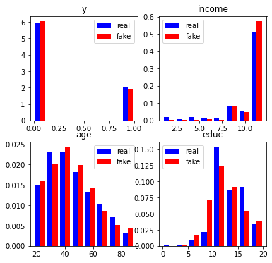
wgan.compare_dfs(df, df_generated1,
                 histogram=dict(variables=["y", "income", "age", "educ"], nrow=2, ncol=2),
                 figsize=3)
-------------comparison of means-------------
source        fake      real
X         17552.04  17552.04
y             0.24      0.25
w             0.53      0.53
age          45.07     45.30
polviews      3.99      4.11
income       11.22     10.60
educ         12.58     13.29
marital       2.46      2.40
sex           1.57      1.55
-------------comparison of stds-------------
source        fake      real
X         10789.54  10789.54
y             0.43      0.44
w             0.50      0.50
age          16.99     16.85
polviews      1.21      1.39
income        1.56      2.47
educ          3.36      2.98
marital       1.72      1.64
sex           0.50      0.50
fig, ax = plt.subplots(1,2, figsize=(12, 4))
plt.suptitle('Scatter plot from Y and the 2 continuous variables',fontsize=20)

ax[0].scatter(df_generated1.age, df.y, color = "Red")
ax[0].scatter(df.age, df.y, color = "Blue")
ax[0].set_xlabel("age")
ax[0].set_ylabel("y")
ax[0].legend(["Fake","Real"])

ax[1].scatter(df_generated1.educ, df.y, color = "Red")
ax[1].scatter(df.educ, df.y, color = "blue")
ax[1].set_xlabel("educ")
ax[1].set_ylabel("y")
ax[1].legend(["Fake","Real"])
<matplotlib.legend.Legend at 0x7f00e1297b90>
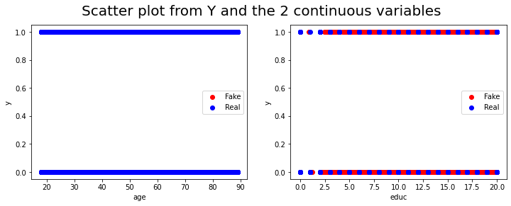
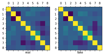
As we can observe, the means, standard error, correlation matrix and distributions (histograms) of the real and simulated data are pretty similar.
data = df_generated1.drop("source", axis=1)
7.2. Application of the simulated data to the code of chapter 3.#
Now we can use this new simulated data in the code from chapter 3 which evaluate the Average Treatment Effect (ATE) in Binary treatment. So we can first recall some of the notations and definitions from the original data because these new simulated data are supposed to have the same definitions.
#pip install pypng
#pip install requests
#pip install econml
#First we import the necesary packages to use in chapter 3 code
from scipy import stats
from scipy.stats import norm
import statsmodels.api as sm
import statsmodels.formula.api as smf
import patsy
import patsy
%matplotlib inline
import matplotlib
import matplotlib.mlab as mlab
import seaborn as sns
import random
import string
import warnings
warnings.filterwarnings('ignore')
import imageio as iio
import matplotlib.image as mpimg
import matplotlib.pyplot as plt
import requests
from urllib.request import urlopen
import imageio
import png
from PIL import Image
from io import BytesIO
/usr/local/lib/python3.7/dist-packages/statsmodels/tools/_testing.py:19: FutureWarning: pandas.util.testing is deprecated. Use the functions in the public API at pandas.testing instead.
  import pandas.util.testing as tm
7.2.1. Notation and definitions#
Let’s establish some notation. Each data point will be defined by the triple \((X_i, W_i, Y_i)\). The vector \(X_i\) represents covariates that are observed for individual \(i\). Treatment assignment is indicated by \(W_i \in \{0, 1\}\), with 1 representing treatment, and 0 representing control. The scalar \(Y_i\) is the observed outcome, and it can be real or binary. Each observation is drawn independently and from the same distribution. We’ll be interested in assessing the causal effect of treatment on outcome.
A difficulty in estimating causal quantities is that we observe each individual in only one treatment state: either they were treated, or they weren’t. However, it’s often useful to imagine that each individual is endowed with two random variables \((Y_i(1), Y_i(0))\), where \(Y_i(1)\) represents the value of this individual’s outcome if they receive treatment, and \(Y_i(0)\) represents their outcome if they are not treated. These random variables are called potential outcomes. The observed outcome \(Y_i\) corresponds to whichever potential outcome we got to see:
Since we can’t observe both \(Y_i(1)\) and \(Y_i(0)\), we won’t be able to make statistical claims about the individual treatment effect \(Y_i(1) - Y_i(0)\). Instead, our goal will be to estimate the average treatment effect (ATE):
Here, when we refer to the randomized setting we mean that we have data generated by a randomized control trial. The key characteristic of this setting is that the probability that an individual is assigned to the treatment arm is fixed. In particular, it does not depend on the individual’s potential outcomes:
This precludes situations in which individuals may self-select into or out of treatment. The canonical failure example is a job training program in which workers enroll more often if they are more likely to benefit from treatment because in that case \(W_i\) and \(Y_i(1) - Y_i(0)\) would be positively correlated.
When condition (7.2) is violated, we say that we are in an observational setting. This is a more complex setting encompassing several different scenarios: sometimes it’s still possible to estimate the ATE under additional assumptions, sometimes the researcher can exploit other sources of variation to obtain other interesting estimands. Here, we will focus on ATE estimation under the following assumption:
In this document we will call this assumption unconfoundeness, though it is also known as no unmeasured confounders, ignorability or selection on observables. It says that all possible sources of self-selection, etc., can be explained by the observable covariates \(X_i\). Continuing the example above, it may be that older or more educated are more likely to self-select into treatment; but when we compare two workers that have the same age and level of education, etc., there’s nothing else that we could infer about their relative potential outcomes if we knew that one went into job training and the other did not.
As we’ll see below, a key quantity of interest will be the treatment assignment probability, or propensity score \(e(X_i) := \mathbb{P}[W_i = 1 | X_i]\). In an experimental setting this quantity is usually known and fixed, and in observational settings it must be estimated from the data. We will often need to assume that the propensity score is bounded away from zero and one. That is, there exists some \(\eta > 0\) such that
This assumption is known as overlap, and it means that for all types of people in our population (i.e., all values of observable characteristics) we can find some portion of individuals in treatment and some in control. Intuitively, this is necessary because we’d like to will be comparing treatment and control at each level of the covariates and then aggregate those results.
As a running example, in what follows we’ll be using an abridged version of a public dataset from the General Social Survey (GSS) (Smith, 2016). The setting is a randomized control trial. Individuals were asked about their thoughts on government spending on the social safety net. The treatment is the wording of the question: about half of the individuals were asked if they thought government spends too much on “welfare” \((W_i = 1)\), while the remaining half was asked about “assistance to the poor” \((W_i = 0)\). The outcome is binary, with \(Y_i = 1\) corresponding to a positive answer. In the data set below, we also collect a few other demographic covariates.
n = data.shape[0]

# Treatment: does the the gov't spend too much on "welfare" (1) or "assistance to the poor" (0)
treatment = "w"

# Outcome: 1 for 'yes', 0 for 'no'
outcome = "y"

# Additional covariates
covariates = ["age", "polviews", "income", "educ", "marital", "sex"]
7.2.2. Difference-in-means estimator#
# Only valid in the randomized setting. Do not use in observational settings.
Y = data.loc[ : , outcome ].copy()
W = data.loc[ : , treatment ].copy()
ate_est = Y[ W == 1 ].mean() - Y[ W == 0 ].mean()
ate_se = np.sqrt(( Y[ W == 1 ].var() / (W == 1).sum() ) + ( Y[ W == 0 ].var() / (W == 0).sum() ))
ate_tstat = ate_est / ate_se
ate_pvalue = 2* norm.cdf( 1 - abs( ate_est / ate_se ) )
ate_results = pd.DataFrame( { "estimate" : [ate_est],
               "std_error" : [ate_se],
               "t_stat" : [ate_tstat],
               "pvalue" : [ate_pvalue] } )
ate_results
| estimate | std_error | t_stat | pvalue | |
|---|---|---|---|---|
| 0 | -0.380113 | 0.004742 | -80.159075 | 0.0 |
And this are the results from original data in chapter 3.
| estimate | std_error | t_stat | pvalue | |
|---|---|---|---|---|
| 0 | -0.347116 | 0.004896 | -70.903029 | 0.0 |
We can also compute the same quantity via linear regression.
# Do not use! standard errors are not robust to heteroskedasticity! (See below)
fmla = outcome + "~" + treatment
ols = smf.ols( fmla, data )
table1 = ols.fit().summary2().tables[1].iloc[1, :4]
table1 = pd.DataFrame(table1)
table1
| w | |
|---|---|
| Coef. | -0.380113 |
| Std.Err. | 0.004548 |
| t | -83.582951 |
| P>|t| | 0.000000 |
This are the original results
| w | |
|---|---|
| Coef. | -0.347116 |
| Std.Err. | 0.004732 |
| t | -73.349622 |
| P>|t| | 0.000000 |
# Use this instead. Standard errors are heteroskedasticity-robust.
# Only valid in randomized setting.
fmla = outcome + "~" + treatment
ols = smf.ols( fmla, data )
table2 = ols.fit().get_robustcov_results(cov_type = "HC2").summary2().tables[1].iloc[1, :4]
table2 = pd.DataFrame(table2)
table2
| w | |
|---|---|
| Coef. | -0.380113 |
| Std.Err. | 0.004742 |
| t | -80.159075 |
| P>|t| | 0.000000 |
These are the original results
| w | |
|---|---|
| Coef. | -0.347116 |
| Std.Err. | 0.004896 |
| t | -70.903029 |
| P>|t| | 0.000000 |
As we can see, the results with synthetic data are pretty close to the original ones.
7.2.3. Turning an experimental dataset into an observational one#
In what follows we’ll purposely create a biased sample to show how the difference in means estimator fails in observational settings. We’ll focus on two covariates: age and political views (polviews). Presumably, younger or more liberal individuals are less affected by the change in wording in the question. So let’s see what happens when we make these individuals more prominent in our sample of treated individuals, and less prominent in our sample of untreated individuals.
# Probabilistically dropping observations in a manner that depends on x

# copying old dataset, just in case
data_exp = data.copy()
data.shape

# defining the group that we will be dropped with some high probability
grp = ((data.w == 1) & ((data.age > 45) | (data.polviews < 5) )) | \
        ((data.w == 0) &  # if untreated AND
        (
            (data.age < 45) |   # belongs a younger group OR
            (data.polviews > 4)  # more liberal
        ))


grp.sum()

# Individuals in the group above have a small chance of being kept in the sample
prob = grp.apply(lambda x: 0.15 if x == True else 0.85 ).tolist()
keep_idx = list( map( bool, [ np.random.binomial( 1 , p , data.shape[0] )[0] for p in prob ] )  )

# Dropping
data = data.loc[ keep_idx , : ].copy()
data.shape
print("From simulated data set:")
print(np.array(keep_idx).mean())
print("From original data set:")
print(0.308030572714899)
From simulated data set:
0.2925697134680487
From original data set:
0.308030572714899
Let’s see what happens to our sample before and after the change. This next figure shows the original dataset. Each observation is represented by a point on either the left or right scatterplots. An outcome of \(Y_i=1\) is denoted by a blue circle, and \(Y_i=0\) is denoted by a red square, but let’s not focus on the outcome at the moment. For now, what’s important to note is that the covariate distributions for treated and untreated populations are very similar. This is what we should expect in an experimental setting under unconfoundedness.
y1, X = patsy.dmatrices( " y ~ 0 + age + polviews" , data_exp , return_type='matrix')

W = data_exp.w.to_numpy()
Y = data_exp.y.to_numpy()

matplotlib.rcParams['figure.figsize'] = [50, 60]
matplotlib.rcParams.update({'font.size': 15})
fig, axes = plt.subplots( 1 , 2 , figsize = ( 10 , 10 ) )

for w in range(2):
    x2 = X[ W == w , 0] + np.random.normal( scale = 0.1 , size = sum( W ==w ) )
    y2 = X[ W == w , 1] + np.random.normal( scale = 0.1 , size = sum( W ==w ) )
    axes[ w ].scatter(
                    x2[ Y[ W == w ] == 1] , y2[ Y[ W == w ] == 1] ,
                    marker = "D", c = (1,0,0,1/4),
                    facecolors = (1,0,0,1/4)
                )
    axes[ w ].scatter(
                    x2[ Y[ W == w ] == 0] , y2[ Y[ W == w ] == 0] ,
                    marker = "o", c = (0,0,1,1/4),
                    facecolors = (0,0,1,1/4)
                )
    axes[ w ].set_xlabel('Age')
    axes[ w ].set_ylabel('Polviews')
    axes[ w ].set_title( f'{"Treated" if w == 1 else "Untreated"}')
WARNING:matplotlib.axes._axes:*c* argument looks like a single numeric RGB or RGBA sequence, which should be avoided as value-mapping will have precedence in case its length matches with *x* & *y*.  Please use the *color* keyword-argument or provide a 2-D array with a single row if you intend to specify the same RGB or RGBA value for all points.
WARNING:matplotlib.axes._axes:*c* argument looks like a single numeric RGB or RGBA sequence, which should be avoided as value-mapping will have precedence in case its length matches with *x* & *y*.  Please use the *color* keyword-argument or provide a 2-D array with a single row if you intend to specify the same RGB or RGBA value for all points.
WARNING:matplotlib.axes._axes:*c* argument looks like a single numeric RGB or RGBA sequence, which should be avoided as value-mapping will have precedence in case its length matches with *x* & *y*.  Please use the *color* keyword-argument or provide a 2-D array with a single row if you intend to specify the same RGB or RGBA value for all points.
WARNING:matplotlib.axes._axes:*c* argument looks like a single numeric RGB or RGBA sequence, which should be avoided as value-mapping will have precedence in case its length matches with *x* & *y*.  Please use the *color* keyword-argument or provide a 2-D array with a single row if you intend to specify the same RGB or RGBA value for all points.
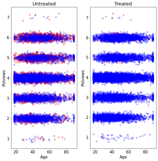
On the other hand, this is what the modified dataset looks like. The treated population is much younger and more liberal, while the untreated population is older and more conservative.
y1, X = patsy.dmatrices( " y ~ 0 + age + polviews" , data , return_type='matrix')

W = data.w.to_numpy()
Y = data.y.to_numpy()

matplotlib.rcParams['figure.figsize'] = [50, 60]
matplotlib.rcParams.update({'font.size': 15})
fig, axes = plt.subplots( 1 , 2 , figsize = ( 10 , 10 ) )

for w in range(2):
    x2 = X[ W == w , 0] + np.random.normal( scale = 0.1 , size = sum( W ==w ) )
    y2 = X[ W == w , 1] + np.random.normal( scale = 0.1 , size = sum( W ==w ) )
    axes[ w ].scatter(
                    x2[ Y[ W == w ] == 1] , y2[ Y[ W == w ] == 1] ,
                    marker = "D", c = (1,0,0,1/4),
                    facecolors = (1,0,0,1/4)
                )
    axes[ w ].scatter(
                    x2[ Y[ W == w ] == 0] , y2[ Y[ W == w ] == 0] ,
                    marker = "o", c = (0,0,1,1/4),
                    facecolors = (0,0,1,1/4)
                )
    axes[ w ].set_xlabel('Age')
    axes[ w ].set_ylabel('Polviews')
    axes[ w ].set_title( f'{"Treated" if w == 1 else "Untreated"}')
WARNING:matplotlib.axes._axes:*c* argument looks like a single numeric RGB or RGBA sequence, which should be avoided as value-mapping will have precedence in case its length matches with *x* & *y*.  Please use the *color* keyword-argument or provide a 2-D array with a single row if you intend to specify the same RGB or RGBA value for all points.
WARNING:matplotlib.axes._axes:*c* argument looks like a single numeric RGB or RGBA sequence, which should be avoided as value-mapping will have precedence in case its length matches with *x* & *y*.  Please use the *color* keyword-argument or provide a 2-D array with a single row if you intend to specify the same RGB or RGBA value for all points.
WARNING:matplotlib.axes._axes:*c* argument looks like a single numeric RGB or RGBA sequence, which should be avoided as value-mapping will have precedence in case its length matches with *x* & *y*.  Please use the *color* keyword-argument or provide a 2-D array with a single row if you intend to specify the same RGB or RGBA value for all points.
WARNING:matplotlib.axes._axes:*c* argument looks like a single numeric RGB or RGBA sequence, which should be avoided as value-mapping will have precedence in case its length matches with *x* & *y*.  Please use the *color* keyword-argument or provide a 2-D array with a single row if you intend to specify the same RGB or RGBA value for all points.
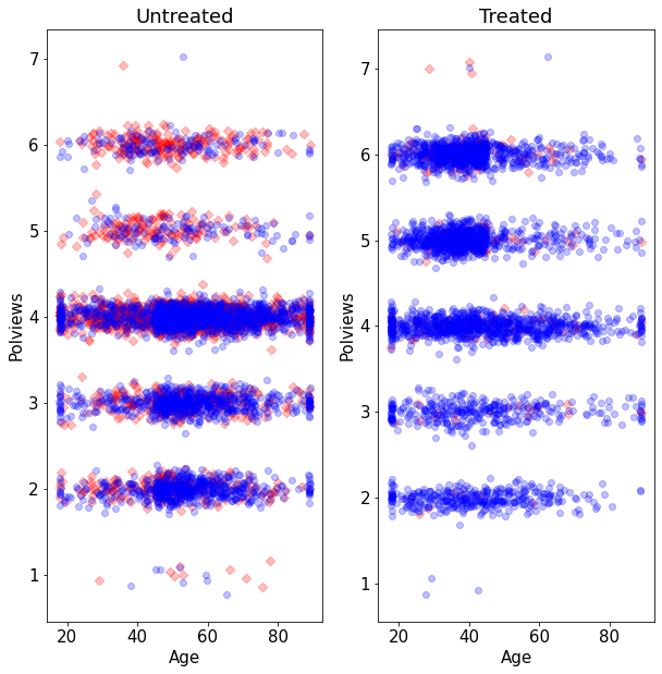
As we would expect the difference-in-means estimate is biased toward zero because in this new dataset we mostly treated individuals for which we expect the effect to be smaller.
# Do not use in observational settings.
# This is only to show how the difference-in-means estimator is biased in that case.
fmla = outcome + "~" + treatment
ols = smf.ols( fmla, data )
ols.fit().get_robustcov_results(cov_type = "HC2").summary2().tables[1]
| Coef. | Std.Err. | t | P>|t| | [0.025 | 0.975] | |
|---|---|---|---|---|---|---|
| Intercept | 0.410729 | 0.007122 | 57.666698 | 0.000000e+00 | 0.396767 | 0.424691 |
| w | -0.320450 | 0.008572 | -37.383068 | 5.000201e-283 | -0.337253 | -0.303646 |
These are the results with the original data
| Coef. | Std.Err. | t | P>|t| | [0.025 | 0.975] | |
|---|---|---|---|---|---|---|
| Intercept | 0.409383 | 0.007198 | 56.876238 | 0.000000e+00 | 0.395274 | 0.423492 |
| w | -0.292019 | 0.008759 | -33.337688 | 1.254523e-229 | -0.309189 | -0.274848 |
Note that the dataset created above still satisfies unconfoundedness (3.3), since discrepancies in treatment assignment probability are described by observable covariates (age and polviews). Moreover, it also satisfies the overlap assumption (3.4), since never completely dropped all treated or all untreated observations in any region of the covariate space. This is important because, in what follows, we’ll consider different estimators of the ATE that are available in observational settings under unconfoundedness and overlap.
7.2.4. Direct estimation#
Our first estimator is suggested by the following decomposition of the ATE, which is possible due to unconfoundedness (3.3).
The decomposition above suggests the following procedure, sometimes called the direct estimate of the ATE:
Estimate \(\mu(x, w) := \mathbf{E}[Y_i|X_i = x,W_i=w]\), preferably using nonparametric methods.
Predict \(\hat{\mu}(X_i, 1)\) and \(\hat{\mu}(X_i, 0)\) for each observation in the data.
Average out the predictions and subtract them.
# Do not use! We'll see a better estimator below.
# Fitting some model of E[Y|X,W]
model = smf.ols("y ~ bs(age, df = 3) * w + bs(polviews, df = 3) * w + bs(income, df = 3) * w + bs(educ, df = 3) * w + bs(marital, df = 3) * w + bs(sex, df = 3) * w", data).fit()
data_aux = data.copy()

# Predicting E[Y|X,W=w] for w in {0, 1}
data_1 = data_aux.copy()
data_1.loc[ : , treatment] = 1
data_0 = data_aux.copy()
data_0.loc[ : , treatment] = 0
muhat_treat = model.predict( data_1 )
muhat_ctrl = model.predict( data_0 )

# Averaging predictions and taking their difference
ate_est = muhat_treat.mean() - muhat_ctrl.mean()
print("From simulated data set:")
print(ate_est)
print("From original data set:")
print(-0.3620616673829665)
From simulated data set:
-0.38409155613997537
From original data set:
-0.3620616673829665
This estimator allows us to leverage regression techniques to estimate the ATE, so the resulting estimate should have smaller root-mean-squared error. However, it has several disadvantages that make it undesirable. First, its properties will rely heavily on the model \(\hat{\mu}(x, w)\) being correctly specified: it will be an unbiased and/or consistent estimate of the ATE provided that \(\hat{\mu}(x, w)\) is an unbiased and/or consistent estimator of \(\mathbf{E}[Y|X=x, W=w]\). In practice, having a well-specified model is not something we want to rely upon. In general, it will also not be asymptotically normal, which means that we can’t easily compute t-statistics and p-values for it.
A technical note. Step 1 above can be done by regressing \(Y_i\) on \(X_i\) using only treated observations to get an estimate \(\hat{\mu}(x, 1)\) first, and then repeating the same to obtain \(\hat{\mu}(x, 0)\) from the control observations. Or it can be done by regression \(Y_i\) on both covariates \((X_i, W_i)\) together and obtaining a function \(\hat{\mu}(x, w)\). Both have advantages and disadvantages, and we refer to Künzel, Sekhon, Bickel, Yu (2019) for a discussion.
7.2.5. Inverse propensity-weighted estimator#
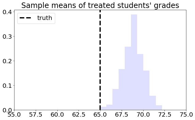
To understand this estimator, let’s first consider a toy problem. Suppose that we’d like to estimate the average effect of a certain learning intervention on students’ grades, measured on a scale of 0-100. We run two separate experiments in schools of type A and B. Suppose that, unknown to us, grades among treated students in schools of type A are approximately distributed as \(Y_i(1) | A \sim N(60, 5^2)\), whereas in schools of type B they are distributed as \(Y_i(1) | B \sim N(70, 5^2)\). Moreover, for simplicity both schools have the same number of students. If we could treat the same number of students in both types of schools, we’d get an unbiased estimate of the population mean grade among treated individuals: \((1/2)60 + (1/2)70 = 75\).
However, suppose that enrollment in the treatment is voluntary. In school A, only 5% enroll in the study, whereas in school B the number is 40%. Therefore, if we take an average of treated students’ grades without taking school membership into account, school B’s students would be over-represented, and therefore our estimate of treated student’s grades would be biased upward.
# Simulating the scenario above a large number of times
A_mean = 60
B_mean = 70
pop_mean = 0.5 * A_mean + 0.5 * B_mean  # both schools have the same size

# simulating the scenario about a large number of times
def mean_school():
    school = np.random.choice([ "A", "B" ], size=100, replace=True, p=[0.5, 0.5])

    t_true = np.random.binomial( 1 , 0.05 , 100 )
    t_false = np.random.binomial( 1 , 0.4 , 100 )
    treated = np.zeros_like( school, dtype = float )
    for i in range( school.size ):
        if school[ i ] == "A":
            treated[ i ] = t_true[ i ]
        else:
            treated[ i ] = t_false[ i ]

    g_true = np.random.normal( loc = A_mean , scale = 5 , size = 100 )
    g_false = np.random.normal( loc = B_mean , scale = 5 , size = 100 )
    grades = np.zeros_like( school, dtype = float )
    for i in range( school.size ):
        if school[ i ] == "A":
            grades[ i ] = g_true[ i ]
        else:
            grades[ i ] = g_false[ i ]

    return np.mean( grades[ treated == 1 ] )

sample_means = np.array([mean_school() for _ in range( 1000 )])

matplotlib.rcParams['figure.figsize'] = [10, 10]
matplotlib.rcParams.update({'font.size': 20})
fig, axes = plt.subplots( 1 , 1 , figsize = ( 10 , 6 ) )
axes.hist( sample_means, density = True , color = (0,0,1,1/8) )
axes.set_xlim([ 55, 75 ])
axes.set_title( "Sample means of treated students' grades" )
axes.axvline( pop_mean , linestyle = "dashed" , linewidth = 4, c= "black" , label = "truth")
axes.legend(loc='upper left')
<matplotlib.legend.Legend at 0x7f008036edd0>
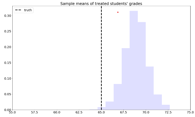
This is the graph of the original data
#Read and show image
url1="https://raw.githubusercontent.com/d2cml-ai/mgtecon634_py/main/figs/fig_1.png"
req1 = requests.get(url1)
im1 = Image.open(BytesIO(req1.content))
im1
To solve this problem, we can consider each school separately, and then aggregate the results. Denote by \(n_A\) the number of students from school \(A\), and \(n_{A,1}\) denote the number of treated students in that school. Likewise, denote by \(n_B\) and \(n_{B,1}\) the same quantities for school \(B\). Then our aggregated means estimator can be written as:
# simulating the scenario about a large number of times
def agg_mean_school():
    school = np.random.choice([ "A", "B" ], size=100, replace=True, p=[0.5, 0.5])

    t_true = np.random.binomial( 1 , 0.05 , 100 )
    t_false = np.random.binomial( 1 , 0.4 , 100 )
    treated = np.zeros_like( school, dtype = float )
    for i in range( school.size ):
        if school[ i ] == "A":
            treated[ i ] = t_true[ i ]
        else:
            treated[ i ] = t_false[ i ]

    g_true = np.random.normal( loc = A_mean , scale = 5 , size = 100 )
    g_false = np.random.normal( loc = B_mean , scale = 5 , size = 100 )
    grades = np.zeros_like( school, dtype = float )
    for i in range( school.size ):
        if school[ i ] == "A":
            grades[ i ] = g_true[ i ]
        else:
            grades[ i ] = g_false[ i ]

    mean_treated_A = np.mean(grades[(treated == 1) & (school == 'A')])
    mean_treated_B = np.mean(grades[(treated == 1) & (school == 'B')])
    # probability of belonging to each school
    prob_A = np.mean(school == 'A')
    prob_B = np.mean(school == 'B')
    result = prob_A * mean_treated_A + prob_B * mean_treated_B

    return result

agg_means = np.array([agg_mean_school() for _ in range( 1000 )])

matplotlib.rcParams['figure.figsize'] = [20, 10]
matplotlib.rcParams.update({'font.size': 20})
fig, axes = plt.subplots( 1 , 1 , figsize = ( 10 , 6 ) )
axes.hist( agg_means, density = True , color = (0,0,1,1/8) )
axes.set_xlim([ 55, 75 ])
axes.set_title( "Aggregated sample means of treated students' grades" )
axes.axvline( pop_mean , linestyle = "dashed" , linewidth = 4, c= "black" , label = "truth")
axes.legend(loc='upper right')
<matplotlib.legend.Legend at 0x7f63fbdd09d0>
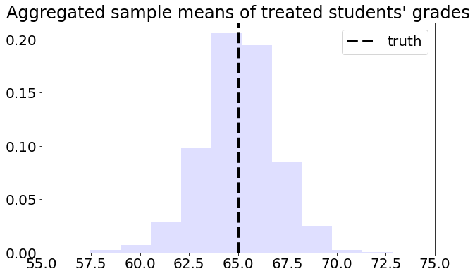
This is the graph of the original data
#Read and show image
url2="https://raw.githubusercontent.com/d2cml-ai/mgtecon634_py/main/figs/fig_2.png"
req2 = requests.get(url2)
im2 = Image.open(BytesIO(req2.content))
im2
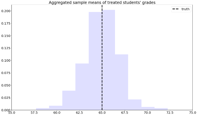
Next, we’ll manipulate the expression (7.7). This next derivation can be a bit overwhelming, but please keep in mind that we’re simply doing algebraic manipulations, as well as establishing some common and useful notation. First, note that we can rewrite the average for school A in (7.7) as
where \(W_i\) is the treatment indicator. Plugging (7.8) back into (7.7),
Note that the \(n_A\) and \(n_B\) will cancel out. Finally, if we denote the sample proportion of treated students in school \(A\) by \(\hat{e}(A_i) \approx n_{A,1}/n_A\) and similar for school \(B\), (7.7) can be written compactly as
where \(X_i \in \{A, B\}\) denotes the school membership. Quantity \(\hat{e}(X_i)\) is an estimate of the probability of treatment given the control variable \(e(X_i) = \mathbb{P}[W_i=1 | X_i ]\), also called the propensity score. Because (7.9) is a weighted average with weights \(W_i/\hat{e}(X_i)\), when written in this form we say that it is an inverse propensity-weighted estimator (IPW).
The IPW estimator is also defined for the case of continuous covariates. In that case, we must estimate the assignment probability given some model, for example using logistic regression, forests, etc. With respect to modeling, the behavior of the IPW estimator is similar to the direct estimator: if \(\hat{e}(X_i)\) is an unbiased estimate of \(e(X_i)\), then (7.9) is an unbiased estimate of \(E[Y(1)]\); and we can show that if \(\hat{e}(X_i)\) is a consistent estimator of \(e(X_i)\), then (7.9) is consistent for \(E[Y(1)]\).
Another important point is that when the estimated treatment propensity \(\hat{e}(X_i)\) is small, the summands in (7.9) can be very large. In particular, if \(\hat{e}(x)\) is exactly zero, then this estimator is undefined. That is why, in addition to requiring conditional unconfoundedness (7.3), it also requires the overlap condition (7.4). In any case, when overlap is small (i.e., \(\hat{e}(x)\) is very close to zero for many \(x\)), IPW becomes an unattractive estimator due to its high variance. We’ll see in the next section an improved estimator that builds upon IPW but is strictly superior and should be used instead.
Finally, we just derived an estimator of the average treated outcome, but we could repeat the argument for control units instead. Subtracting the two estimators leads to the following inverse propensity-weighted estimate of the treatment effect:
The argument above suggests the following algorithm:
Estimate the propensity scores \(e(X_i)\) by regressing \(W_i\) on \(X_i\), preferably using a non-parametric method.
Compute the IPW estimator summand:
Compute the mean and standard error of the new variable \(Z_i\)
from sklearn.linear_model import LassoCV
from sklearn.preprocessing import StandardScaler
from sklearn.linear_model import RidgeCV, ElasticNetCV
from sklearn.linear_model import LinearRegression
from sklearn import linear_model
import itertools
from pandas.api.types import is_string_dtype
from pandas.api.types import is_numeric_dtype
from pandas.api.types import is_categorical_dtype
from itertools import compress
import statsmodels.api as sm
import statsmodels.formula.api as smf
from sklearn.feature_selection import SelectFromModel
class standard_skl_model:

    def __init__(self, model ):
        self.model = model

    def fit( self, X, Y ):

        # Standarization of X and Y
        self.scaler_X = StandardScaler()
        self.scaler_X.fit( X )
        std_X = self.scaler_X.transform( X )

        self.model.fit( std_X , Y )

        return self

    def predict( self , X ):

        self.scaler_X = StandardScaler()
        self.scaler_X.fit( X )
        std_X = self.scaler_X.transform( X )

        prediction = self.model.predict( std_X )

        return prediction
Differences between the type responde in glmnet. The response input gives as probabilities while class give us the labels for the observations.
Differences between cv.glmnet and Sklearn here.
from sklearn.linear_model import LogisticRegressionCV

fmla = "bs(age, df = 3) + bs(polviews, df = 3) + bs(income, df = 3) +  bs(educ, df = 3) + bs(marital, df = 3) + bs(sex, df = 3)"
W = data.loc[ : ,treatment]
Y = data.loc[ : ,outcome]
XX = np.asarray( patsy.dmatrix( fmla, data ) )
# Available in randomized settings and observational settings with unconfoundedness+overlap

# Estimate the propensity score e(X) via logistic regression using splines
logit = standard_skl_model( LogisticRegressionCV(  cv= 10 , penalty = 'l2',
                                                   random_state = 0,
                                                   solver = "newton-cg" ) ).fit(
                    XX, W)

prob = logit.model.predict_proba( XX )

e_hat = np.apply_along_axis(  np.max , 1  , prob )
# Using the fact that
z = Y * ( ( W / e_hat ) - ( ( 1- W ) / ( 1 - e_hat ) ) )

ate_est = (z).mean()
ate_se = np.sqrt( z.var()) / np.sqrt(len(z))
ate_tstat = ate_est / ate_se
ate_pvalue = 2* norm.cdf( 1 - abs( ate_est / ate_se ) )
ate_results = pd.DataFrame( { "estimate" : [ate_est],
               "std_error" : [ate_se],
               "t_stat" : [ate_tstat],
               "pvalue" : [ate_pvalue] } )
ate_results
| estimate | std_error | t_stat | pvalue | |
|---|---|---|---|---|
| 0 | -0.717084 | 0.016164 | -44.363725 | 0.0 |
Results from the original data
| estimate | std_error | t_stat | pvalue | |
|---|---|---|---|---|
| 0 | -0.413384 | 0.011955 | -34.57801 | 3.513410e-247 |
7.3. Augmented inverse propensity-weighted (AIPW) estimator#
The next augmented inverse propensity-weighted estimator (AIPW) of the treatment effect is available under unconfoundedness (7.3) and overlap (7.4):
Let’s parse (7.10). Ignoring the superscripts for now, the first two terms correspond to an estimate of the treatment effect obtained via direct estimation. The next two terms resemble the IPW estimator, except that we replaced the outcome \(Y_i\) with the residuals \(Y_i - \hat{\mu}(X_i, W_i)\). At a high level, the last two terms estimate and subtract an estimate of the bias of the first.
The superscripts have to do with a technicality called cross-fitting that is required to prevent a specific form of overfitting and allow certain desirable asymptotic properties to hold. That is, we need to fit the outcome and propensity models using one portion of the data, and compute predictions on the remaining portion. An easy way of accomplishing this is to divide the data into K folds, and then estimate \(K\) models that are fitted on \(K-1\) folds, and then compute predictions on the remaining Kth fold. The example below does that with \(K=5\). Note that this is different from cross-validation: the goal of cross-validation is to obtain accurate estimates of the loss function for model selection, whereas the goal of cross-fitting is simply to not use the same observation to fit the model and produce predictions.
The AIPW estimator (7.10) has several desirable properties. First, it will be unbiased provided that either \(\hat{\mu}(X_i, w)\) or \(\hat{e}(X_i, w)\) is unbiased. Second, it will be consistent provided that either \(\hat{\mu}(X_i, w)\) or \(\hat{e}(X_i, w)\) is consistent. This property is called double robustness (DR), because only one of the outcome or propensity score models needs to be correctly specified, so the estimator is “robust” to misspecification in the remaining model. Under mild assumptions, it is also asymptotically normal and it is efficient, that is has the smallest asymptotic variance than any other estimator. In fact, it even has smaller variance than the difference-in-means estimators in the randomized setting and is therefore superior to it.
The next snippet provides an implementation of the AIPW estimator where outcome and propensity models are estimated using generalized linear models with splines (via glmnet and splines packages).
Here’s another example of AIPW-based estimation using random forests via the package grf. The function average_treatment_effect computes the AIPW estimate of the treatment effect, and uses forest-based estimates of the outcome model and propensity scores (unless those are passed directly via the arguments Y.hat and W.hat). Also, because forests are an ensemble method, cross-fitting is accomplished via out-of-bag predictions – that is, predictions for observation \(i\) are computed using trees that were not constructed using observation \(i\).
import econml
# Main imports
from econml.orf import DMLOrthoForest, DROrthoForest
from econml.dml import CausalForestDML
from econml.grf import CausalForest
from econml.sklearn_extensions.linear_model import WeightedLassoCVWrapper, WeightedLasso, WeightedLassoCV
from sklearn.linear_model import MultiTaskLassoCV
# Helper imports
import numpy as np
from itertools import product
from sklearn.linear_model import Lasso, LassoCV, LogisticRegression, LogisticRegressionCV
import matplotlib.pyplot as plt
from sklearn.tree import DecisionTreeRegressor
from sklearn.ensemble import RandomForestRegressor
from econml.grf import RegressionForest
%matplotlib inline
import patsy
fmla = 'age+polviews+income+educ+marital+sex'
desc = patsy.ModelDesc.from_formula(fmla)
desc.describe()
matrix = patsy.dmatrix(fmla, data, return_type = "dataframe")

T = data.loc[ : ,"w"]
Y = data.loc[ : ,"y"]
X = matrix
W = None
# Estimate a causal forest.
est2 = CausalForest(n_estimators=100, min_samples_leaf=5,
                       max_depth=50,
                       verbose=0, random_state=123)

est2.fit(X, T, Y)
CausalForest(max_depth=50, random_state=123)
# Get residuals  and propensity

regr = RegressionForest(max_depth=50, random_state=123,
                        n_estimators=100)

e_hat = regr.fit(X, T).predict(X).flatten() # P[W=1|X]
m_hat = regr.fit(X, Y).predict(X).flatten() # E[Y|X]
Finally, even when overlap holds, when the propensity score is small AIPW can have unstable performance. In that case, other estimators of the average treatment effect are available. For example, see the approximate residual balancing (ARB) method in Athey, Imbens and Wager (2016) and its accompanying R package balanceHD.
7.3.1. Diagnostics#
Here we show some basic diagnostics and best practices that should always be conducted. Although failing these tests should usually cause concern, passing them does not mean that the analysis is entirely free from issues. For example, even if our estimated propensity scores are bounded away from zero and one (and therefore seem to satisfy the overlap assumption), they may still be incorrect – for example, if we rely on modeling assumptions that are simply not true. Also, although we should expect to pass all the diagnostic tests below in randomized settings, it’s good practice to check them anyway, as one may find problems with the experimental design.
7.3.2. Assessing balance#
As we saw in Section (3.3), in observational settings the covariate distributions can be very different for treated and untreated individuals. Such discrepancies can lead to biased estimates of the ATE, but as hinted in Section (3.5), one would hope that by up- or down-weighting observations based on inverse propensity weights their averages should be similar. In fact, we should also expect that averages of basis functions of the covariates should be similar after reweighting. This property is called balance. One way to check it is as follows. Given some variable \(Z_i\) (e.g., a covariate \(X_{i1}\), or an interaction between covariates \(X_{i1}X_{i2}\), or a polynomial in covariates \(X_{i1}^2\), etc), we can check the absolute standardized mean difference (ASMD) of \(Z_i\) between treated and untreated individuals in our data,
where \(\bar{Z}_1\) and \(\bar{Z}_0\) are sample averages of \(Z_i\), and \(s_1\) and \(s_0\) are standard deviations of \(Z_i\) for the two samples of treated and untreated individuals. Next, we can check the same quantity for their weighted counterparts \(Z_{i}W_i/\hat{e}(X_i)\) and \(Z_i(1-W_i)/(1-\hat{e}(X_i))\). If our propensity scores are well-calibrated, the ASMD for the weighted version should be close to zero.
# Here, adding covariates and their interactions, though there are many other possibilities.
fmla = 'age+polviews+income+educ+marital+sex+age:polviews+age:income+age:educ+age:marital+age:sex+polviews:income+polviews:educ+polviews:marital+polviews:sex+income:educ+income:marital+income:sex+educ:marital+educ:sex+marital:sex'
desc = patsy.ModelDesc.from_formula(fmla)
desc.describe()

# Using the propensity score estimated above
#residuals = est2.fit(Y, T, X=X, W=W, cache_values=True).residuals_
#T_res = residuals[1]
#e_hat = T - T_res

regr = RegressionForest(max_depth=50, random_state=123,
                        n_estimators=100)

e_hat = regr.fit(X, T).predict(X).flatten() # P[W=1|X]
m_hat = regr.fit(X, Y).predict(X).flatten() # E[Y|X]

matrix = patsy.dmatrix(fmla, data, return_type = "dataframe").iloc[:, 1:]
W = data.loc[ : ,"w"]
Y = data.loc[ : ,"y"]
XX = matrix
T = None
pp = matrix.shape[1]
# Unadjusted covariate means, variances and standardized abs mean differences
means_treat = XX[W == 1].mean()
means_ctrl = XX[W == 0].mean()
abs_mean_diff = (means_treat - means_ctrl).abs()

var_treat = XX[W == 1].var()
var_ctrl = XX[W == 0].var()
std = np.sqrt((var_treat + var_ctrl))
# Adjusted covariate means, variances and standardized abs mean differences
means_treat_adj = (XX*(pd.DataFrame(W/e_hat).values)).mean()
means_ctrl_adj = (XX*(pd.DataFrame((1-W)/(1-e_hat)).values)).mean()
abs_mean_diff_adj = (means_treat_adj - means_ctrl_adj).abs()

var_treat_adj = (XX*(pd.DataFrame(W/e_hat).values)).var()
var_ctrl_adj = (XX*(pd.DataFrame((1-W)/(1-e_hat)).values)).var()
std_adj = np.sqrt((var_treat_adj + var_ctrl_adj))
# Create dataframe to make plots
frame = { 'abs_mean_diff': abs_mean_diff, 'std': std, 'abs_mean_diff_adj': abs_mean_diff_adj, 'std_adj': std_adj  }
result = pd.DataFrame(frame)
result["std_abs_mean"] = result["abs_mean_diff"]/result["std"]
result["std_abs_mean_adj"] = result["abs_mean_diff_adj"]/result["std_adj"]
result.reset_index(inplace=True)
result = result.rename(columns = {'index':'vars'})
# Plotting
result = result.sort_index( ascending=False)
fig, ax = plt.subplots()
#x = np.arange(0, 10, 1)
plt.xlim(0, 1)
sns.scatterplot(data=result, x="std_abs_mean", y="vars", ax =ax)
sns.scatterplot(data=result, x="std_abs_mean_adj", y="vars", ax =ax)
plt.title("Standardized absolute mean differences")
Text(0.5, 1.0, 'Standardized absolute mean differences')
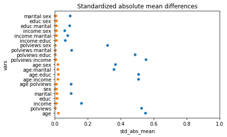
This is the graph of the original data
#Read and show image
url3="https://raw.githubusercontent.com/d2cml-ai/mgtecon634_py/main/figs/fig_3.png"
req3 = requests.get(url3)
im3 = Image.open(BytesIO(req3.content))
im3
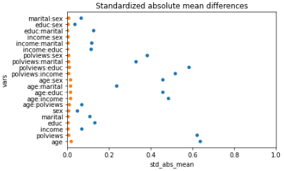
Note above how in particular age and polviews – the variables we chose to introduce imbalance in Section (3.3) – are far from balanced before adjustment, as are other variables that correlate with them.
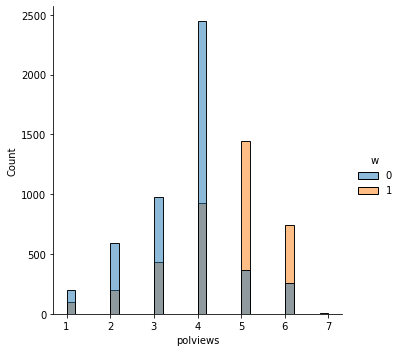
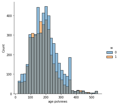
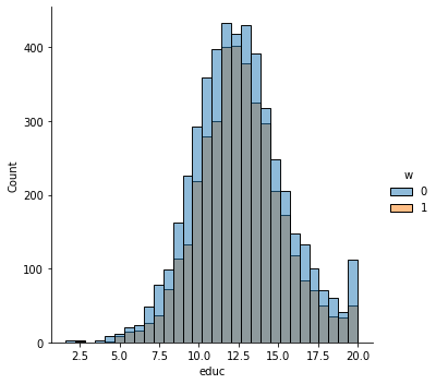
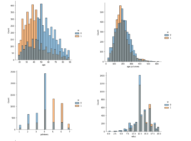
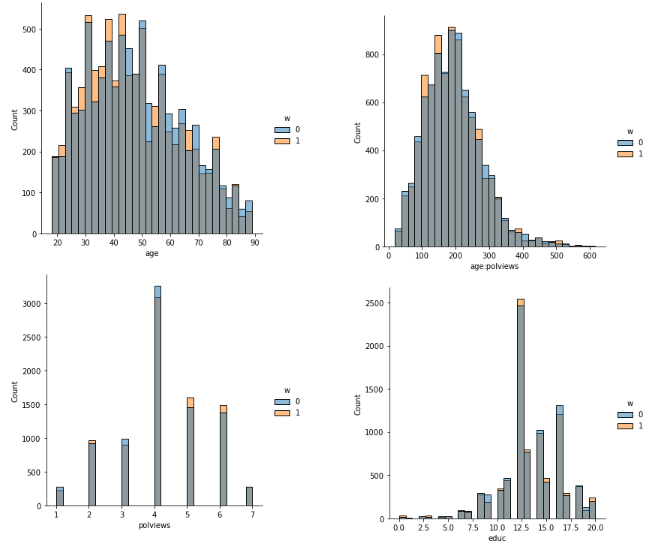
In addition to the above, we can check the entire distribution of covariates (and their transformations). The next snippet plots histograms for treated and untreated individuals with and without adjustment. Note how the adjusted histograms are very similar – that is what we should expect.
data_2 = matrix[["age", "polviews", "age:polviews", "educ",]]
# merge covariates and treatment variable
data_3 = pd.merge(data_2, W, right_index = True,
               left_index = True)
data_3["IPW"] = np.where(data_3["w"] == 1, 1/e_hat, 1 / (1 - e_hat))
# Covariate histograms (unajusted)
sns.displot(data_3, x="age", hue="w", bins=30)
sns.displot(data_3, x="polviews", hue="w", bins=30)
sns.displot(data_3, x="age:polviews", hue="w", bins=30)
sns.displot(data_3, x="educ", hue="w", bins=30)
<seaborn.axisgrid.FacetGrid at 0x7f6408f91550>
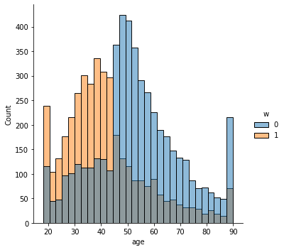
This is the graph of the original data
#Read and show image
url4="https://raw.githubusercontent.com/d2cml-ai/mgtecon634_py/main/figs/fig_4.png"
req4 = requests.get(url4)
im4 = Image.open(BytesIO(req4.content))
im4
# Covariate histograms (ajusted)
sns.displot(data_3, x="age", hue="w", bins= 30, weights=np.array(data_3["IPW"]) )
sns.displot(data_3, x="polviews", hue="w", bins= 30, weights=np.array(data_3["IPW"]) )
sns.displot(data_3, x="age:polviews", hue="w", bins= 30, weights=np.array(data_3["IPW"]) )
sns.displot(data_3, x="educ", hue="w", bins= 30, weights=np.array(data_3["IPW"]) )
<seaborn.axisgrid.FacetGrid at 0x7f63e3a600d0>
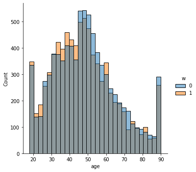
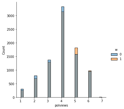
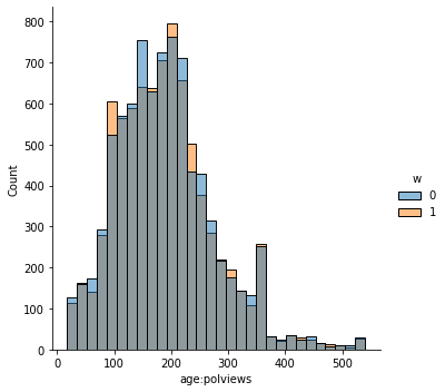
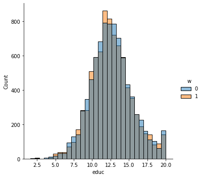
This is the graph of the original data
#Read and show image
url5="https://raw.githubusercontent.com/d2cml-ai/mgtecon634_py/main/figs/fig_5.png"
req5 = requests.get(url5)
im5 = Image.open(BytesIO(req5.content))
im5
There exist other types of balance checks. We recommend checking out the R package cobalt. This vignette is a good place to start.
7.3.2.1. Assessing overlap#
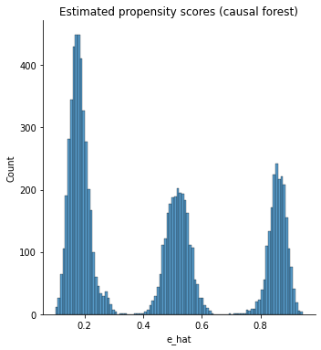
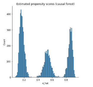
It’s also important to check the estimated propensity scores. If they seem to cluster at zero or one, we should expect IPW and AIPW estimators to behave very poorly. Here, the propensity score is trimodal because of our sample modification procedure in Section (3.3): some observations are untouched and therefore remain with assignment probability \(0.5\), some are dropped (kept) with probability 15% (85%).
g = sns.displot(e_hat, bins=100)
g.set_axis_labels("e_hat")
# g.set_titles("Estimated propensity scores (causal forest)")
plt.title("Estimated propensity scores (causal forest)")
Text(0.5, 1.0, 'Estimated propensity scores (causal forest)')
This is the graph of the original data
#Read and show image
url6="https://raw.githubusercontent.com/d2cml-ai/mgtecon634_py/main/figs/fig_6.png"
req6 = requests.get(url6)
im6 = Image.open(BytesIO(req6.content))
im6
When overlap fails, the methods described above will not produce good estimates. In that case, one may consider changing the estimand and targeting the average treatment effect on the treated (ATT) \(\mathbf{E}[Y_i(1) - Y_i(0) | W_i=1]\), or trimming the sample and focusing on some subgroup \(G_i\) with bounded propensity scores \(\mathbf{E}[Y_i(1) - Y_i(0) | G_i]\), as discussed in
Crump, Hotz, Imbens and Mitnik (Biometrika, 2009).
As we can see, all the results obtained with the synthetic data are quite similar to those of the original data.


